DESIGN PRINCIPLES - TASK 1: EXPLORATION
10.02.25 - 16.02.25 (Week 2 - Week 3)
Michelle (0373843)
Design Principles / Bachelor of Design (Honours) in Creative Media / Taylor's University
Task 1: Exploration
Michelle (0373843)
Design Principles / Bachelor of Design (Honours) in Creative Media / Taylor's University
Task 1: Exploration
TABLE OF CONTENTS
INSTRUCTIONS
LECTURES
Elements of Design
 |
| Fig 1.1 Design Elements (inspiration: https://www.onlinedesignteacher.com/2015/11/design-elements_91.html) |
1. Point (the simplest element
of design) - Its movement in space creates other two- and three-dimensional
figures.
2. Line - Indicates directions,
define shapes and space boundaries, suggest motions, form patterns and
textures.
3. Shape (2D area) - Visible when a line creates an enclosed area or an
apparent change in color, texture, or value (light/dark), could be geometric
or organic.
4. Form (3D area) - Creates
volume when it encloses space, in 2D media it must be implied.
5. Texture - tactile qualities
experienced by touch (actual) or through visual representation
(simulated).
6. Space - In visual art it's
surface area defined by height and width, despite these boundaries, endless
spatial qualities can be implied. In 3D space, it's experienced with our
positions in relation to others, from the outside we experience mass, from
the inside, volume.
7. Color - The visual
byproduct of the spectrum of light in the wavelengths of the human
eye.
- Hue: colors of the spectrum
- Value: lightness/darkness (adding white produces tint, adding gray produces tone, adding black produces shade).
- Saturation/Chroma: the purity/intensity of a color.
- Color schemes: Color grouping that provides distinct color harmonies.
 |
| Fig 1.2 Color Hue & Value (source: https://medium.muz.li/want-to-become-a-better-ux-designer-in-2021-know-the-science-behind-color-theory-e979fce72c03) |
 |
| Figure 1.3 Color Schemes (source: https://www.pinterest.com/pin/10203536650860534/) |
Principles of Design
1. Gestalt Theory - Rules that
describe how the human eye perceives visual elements, showing that complex
scenes can be reduced to simple shapes.
 |
| Figure 2.1.1 Gestalt Theory (inspiration: https://www.pinterest.com/pin/1148980923654379936/) |
- Principle of Similarity: Human eye tends to perceive similar elements in design as a complete picture/group, even if they're separated because the brain craft a link between elements of similar nature.
 |
| Fig 2.1.2 Principle of Similarity (source: https://images.app.goo.gl/azLQJXAZjG3Nf2Wn8) |
- Principle of Closure: Human eye prefers to see complete shapes by filling in missing visual information.
 |
| Fig 2.1.3 Principle of Closure (source: https://selfmadedesigner.com/gestalt-theory-design/) |
- Principle of Continuation: Human eye follows paths, lines, and curves. It prefers a continuous flow of visual elements rather than separated objects.
 |
| Fig 2.1.4 Principle of Continuation (source: https://selfmadedesigner.com/gestalt-theory-design/) |
- Law of Symmetry & Order: Symmetrical elements tend to be perceived as a unified group than unsymmetrical objects.
 |
| Fig 2.1.5 Law of Symmetry & Order (source: https://selfmadedesigner.com/gestalt-theory-design/) |
- Principle of Figure/Ground: Human eye perceive objects as foreground (stand out in front as figure) or background.
 |
| Fig 2.1.6 Principle of Figure/Ground (source: https://selfmadedesigner.com/gestalt-theory-design/) |
- Principle of Proximity: The placement of design elements based on its relationship to each other, connected elements are placed together.
 |
| Fig 2.1.7 Principle of Proximity (source: https://www.crowdspring.com/blog/visual-branding-psychology/#proximity) |
2. Contrast - The juxtaposition of strongly dissimilar elements (e.g. size, color, shape, type, etc.) which provides visual interest. The bigger the difference, the higher the contrast gets.
.jpg) |
| Fig 2.2.1 Contrast through different elements (inspiration: https://red-website-design.co.uk/types-contrast-graphic-design/) |
 |
| Fig 2.2.2 Contrast Intensity (source: https://www.pinterest.com/pin/536843218053704944/) |
3. Balance - The distribution
of elements to create visual weight in design, could be symmetrical (equal weight on either
side of central axis: horizontal/vertical, result in bilateral balance)
or asymmetrical (unequal, has a dominant side, complex relationship
between elements, offers visual variety, interest, and modernism).
 |
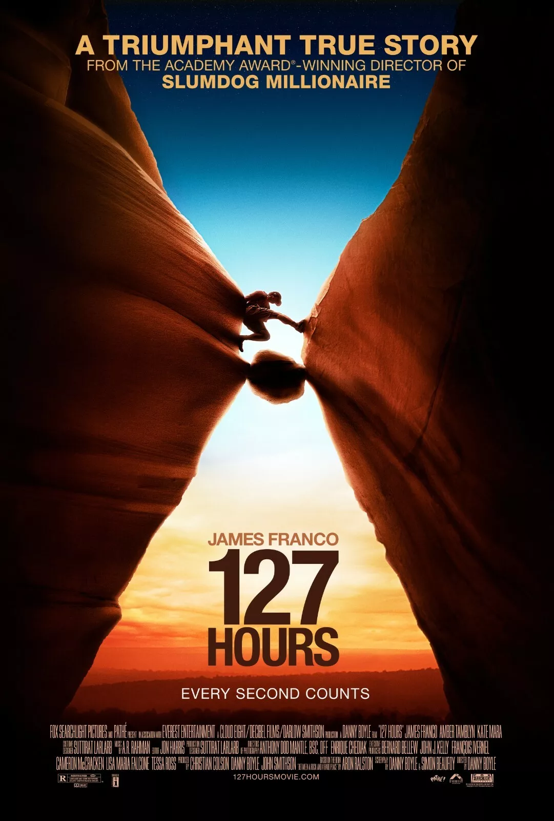
| Fig 2.3.1 Symmetrical vs asymmetrical balance in movie poster (source: 127 Hours - Spider-Man: No Way Home - Inside Out 2 - Forest Gump) |
- The Golden Ratio (phi): A guide to create visual balance, harmony, and structure.
 |
| Fig 2.3.2 Golden Ratio (My own original artwork: Keep Going) |
- Rule of thirds: Division into thirds, both horizontally and vertically as a composition guideline.
 |
| Fig 2.3.3 Rule of Thirds (My own original artwork: Endless Creativity) |
4. Emphasis - The dominance and
focus in design. The area of emphasis is called focal point.

5. Repetition - Creates rhythm
and pattern. Variety is essential to avoid monotony.
 |
| Fig 2.5 Indonesian Batik Parang Motif (source: https://javaprivatetour.com/wp-content/uploads/2024/10/Batik-Parang.jpg) |
6. Movement - The way design
leads the eye in, around, and through a composition. Occurs when objects
seem to be moving in design from kinds of shapes, forms, lines and curves
used.
 |
| Fig 2.6 Movement illusion though simple wavy lines (source: https://www.pinterest.com/pin/112378953196410669/) |
7. Hierarchy - Directs viewers
to the most important information first and navigate secondary
content.
 |
| Fig 2.7 Visual Hierarchy (source: https://wpmudev.com/blog/wp-content/uploads/2018/10/How-to-achieve-visual-hierarchy-design-tips-for-developers.png) |
8. Alignment - The placement of
elements that edges line up along common rows or columns, or their bodies
along a common center.
 |
| Fig 2.8 Alignment (source: https://www.ramotion.com/blog/alignment-in-web-design/) |
9. Harmony - The sense that all the different elements of design fit together through theme, aesthetic, style, or mood. It
becomes monotony without variety.
 |
| Fig 2.9 Illustration of Indonesia in harmony (source: https://www.pinterest.com/pin/1759287347848708/) |
10. Unity - The repetition of
particular elements through colors, shapes, or materials.
 |
| Fig 2.10 Unity in the use of type, color, and shapes in infographic (source: https://www.pinterest.com/pin/297308012912333157/) |
11. Scale - The size and
dimension of figures and forms relative to specific unit of measure,
determined through actual measurement or visual comparison.
12. Proportion - The
relationship of elements in a composition and how they compare to one
another in size, color, quantity, degree, setting, ratio, etc.
13. Symbol - A sign, shape, or
object to represent something else.
 |
| Fig 2.11 Icon meaning (source: https://www.pinterest.com/pin/947233734149513015/) |
14. Word and Image - The usage
of suitable images, words, and type in design.
 |
| Fig 2.12 Corresponding type and image (source: https://www.pinterest.com/pin/837106649524440660/) |
SELECTED DESIGN & EXPLANATION

Title of art : Elemental-Bench-Payoff-Movie-Poster
Designer : Disney - Pixar
Year : 2023
Size : 1080 x 1600 pixels
Art medium : Digital
The artwork above is a poster for a movie called "Elemental". The movie tells a story about how four different elements (fire, water, land, and air) live in a world together. This idea transfers to be portrayed in the poster which is very filled up as a result of showcasing the diverse elemental characters along with it's world behind it. This artwork stood out to me because I personally liked maximalist designs packed with a blend of colors, shapes, and textures. I love when an artwork is designed so it is able to display many different things in harmony and is pleasing to the eye. The movie concept allows opportunities for the use of many design elements to create diversity balanced with the application of design principles to create unity amongst the differences.
Brief-Analysis
The artwork shows a good scale, alignment, and hierarchy with the main characters being the biggest at middle-front, side characters in the side mid-ground, then the background being the smallest and furthest away. The text for the title accurately expresses the theme "elemental" . The elements of design are utilized in designing the four elements with different colors, shapes, and textures which allows a sense of separation between them. Despite the need to highlight diversity, the overall design still fit together and look whole.
FEEDBACKS
Week 2 consultation: Good application of design principles in making titles in lecture summary bold and different color. Need to add graphic to all of them to make assure my understanding of the design principles.
Week 3 consultation: Nearly done, just needed a bit more graphic for Gestalt Theory. Brief on task 2 will be given next week (week 4).


Dear Michelle,
ReplyDeleteRegarding the Pixar poster you chose, I've had a change of heart. I've loved Pixar animations since I was a kid, and I reckon you do too. However, to be honest, as much as I love them, I don't find this poster aesthetically pleasing. It's just okay—straight to the point and gets the job done, but it's rather forgettable.
That being said, I'd recommend finding a more artistic and visually stunning graphic or poster. I could be wrong, so let me know what you think.
Hello Sir! Thank you so much for sharing your thoughts with me, I really appreciate it. I deeply apologize for not checking your comment sooner. I have never received comments in my blogger before, so I'm not aware of it. I will be more aware from now on!
DeleteAbout the poster I chose, I agree it is not really pleasing to look at, which saddens me, because I personally really Iove the movie concept and story. However, since our next task is to improve on our chosen artwork, I figure this would be perfect opportunity for me to try and bring the movie's essence better and more accurately. This was the reason behind me choosing the poster. In this case, should I find a new one, Sir? I don't mind changing if you do think its better. I look forward to your respose. Thank you in advance.